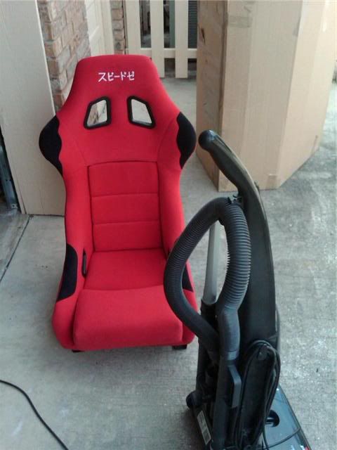
ok so I am trying to set a plaid pattern i made to the insert of a racing seat. All i can manage to do is set it as a flat gradient fill. How do i get it to conform the the shape of the seat cushions
Photoshop can’t even make that look good
I’m sure it can.
It makes hondas look good doesnt it
Yea but not plaid riced out rides
so you are calling oem VW’s riced out?
interesting
Wow, everyone is so aggressive today. Be aggressive, b b aggressive.
I know there is a tool that you can distort the filler with, I have to look tho.
yeah its the warp feature but that does not make up shading.
Oh, I just got what you mean. I thought you cut a pattern from somewhere, and were trying to add it over the existing seat pattern. You could make a separate file, paste just the gradient fill, save it, then “place” from that… that would let you use the warp tool.
Yea the new vws are whack with the stupid emo plaid interior
they went a bit overboard with it, but it was a throwback to the mk1 GTI from 1976 in europe that had a plaid interior. the mk1 sciroccos and a few early Porsche 911 variants had plaid centers in the seats. just a thing of the era for european cars
Most shit from the 70’s should stay there. Theres a reason why they stopped doing it
plaid ftmfw.
You might be able to do it using multiple layers in Ps. Post up the pics, I might try it out.
yeah i figured it out using way, pattern stamp, layer options bevel/emboss with pillow bevel and then made some of my own shadows. I was doing this at work so and only worked till noon so the following picture is only like 50%
Before
After

do it, but with no stupid lettering…i have some fake burberry scrafs around my house i was gonna use on my aw11 when i owned it.
Nice job with the photoshopping! I think that’ll look awesome when it’s done!
looks kinda cool
I have some real burberry material right here :ninja
Looks good, another way would have been to desaturate what you were going to put the pattern over, then put the pattern on, lower the opacity of the pattern layer, then use dodge and burn to make it look right. Probably shorter ways, but that’s what I would’ve done.
i’d go with that blue water design u have on ur dash pieces already. keep it consistent. i liked those bits on your car, Ron. keep it asian looking. its a Lexus.
