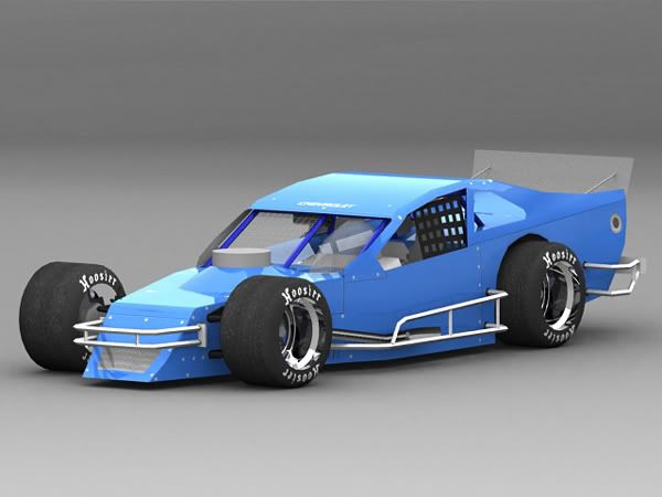
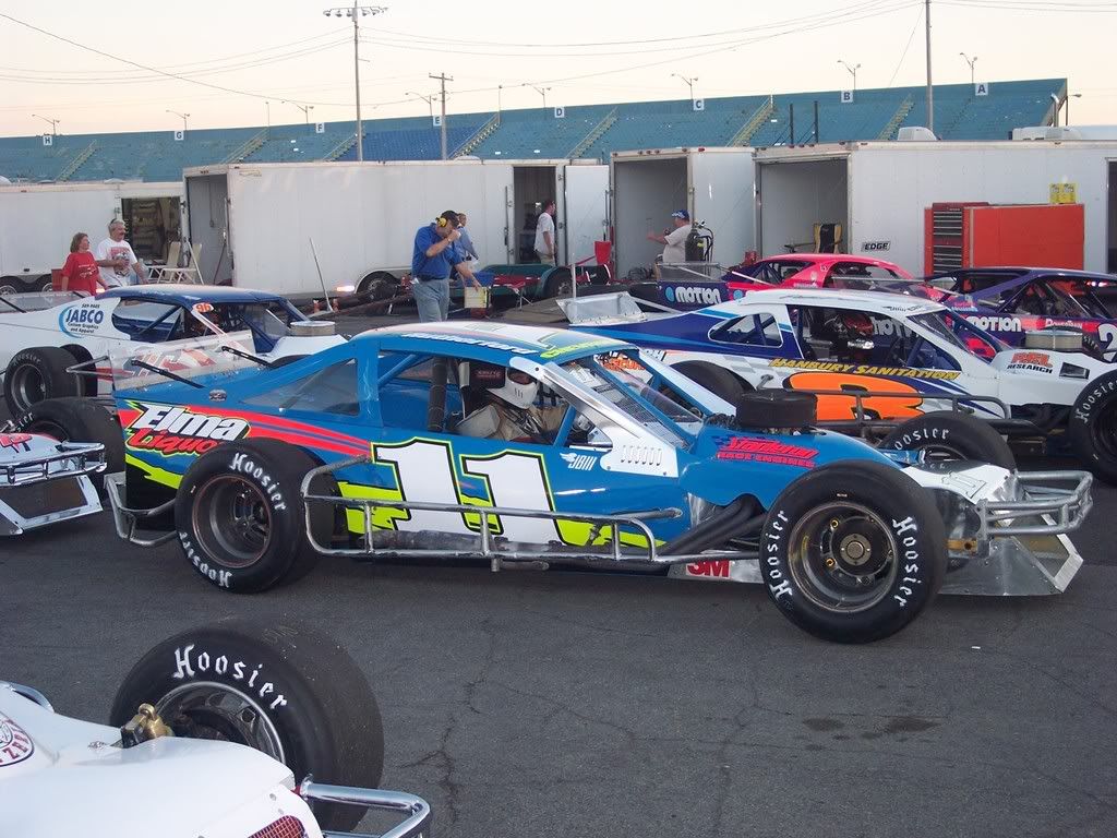
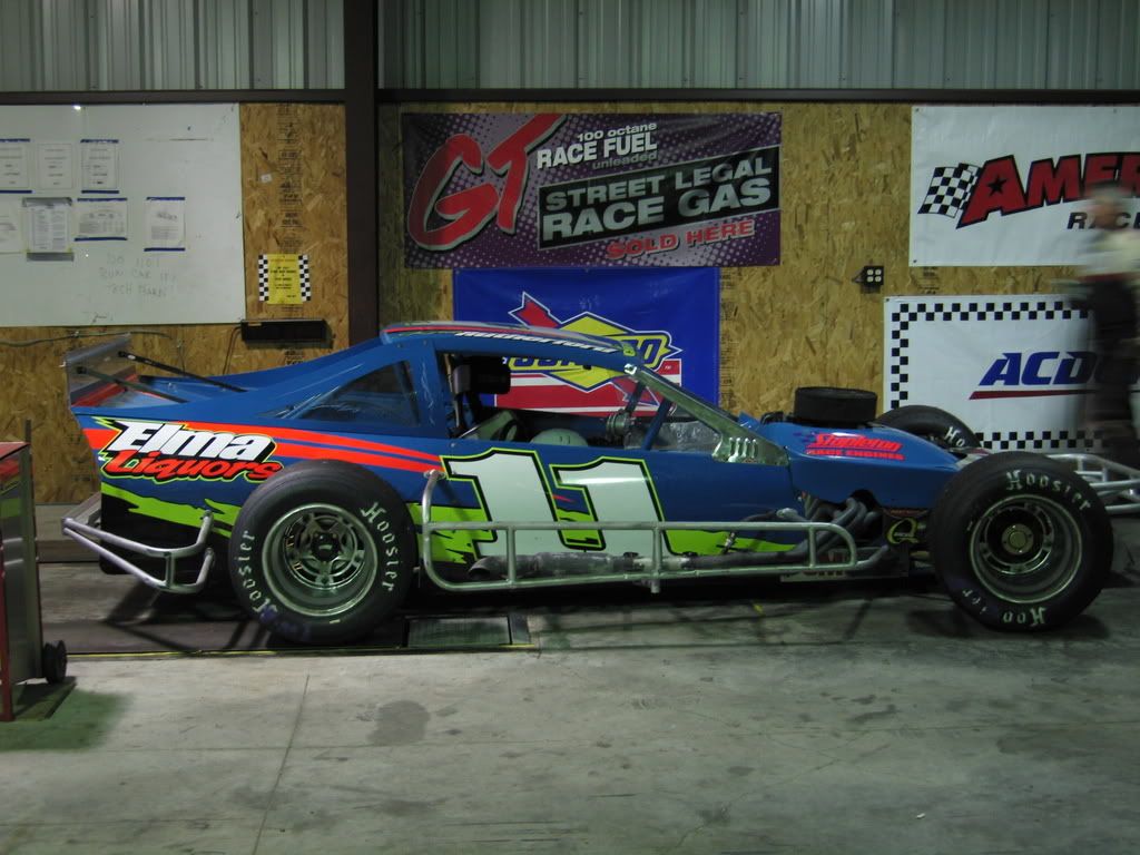
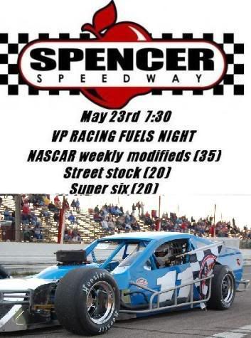
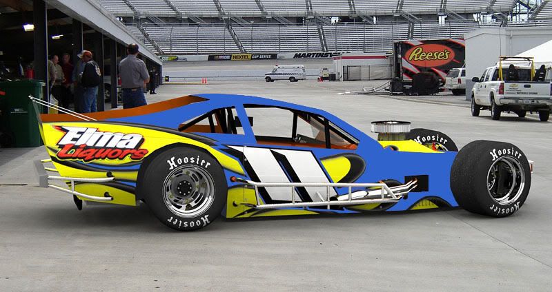
Ok so far we just got the blue car with the white #11’s on each side. Font can be changed along with colors. if someone can come up with something and it looks half way decent we will prolley do it.
Last years looked like this:
this year its a little bit darker then this but still vibrant

This is the only guy that i have seen that makes really good designs.
http://www.tucknut.net/whelen.htm
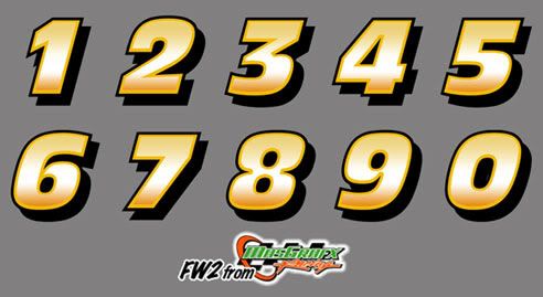
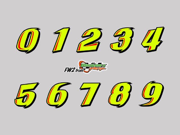
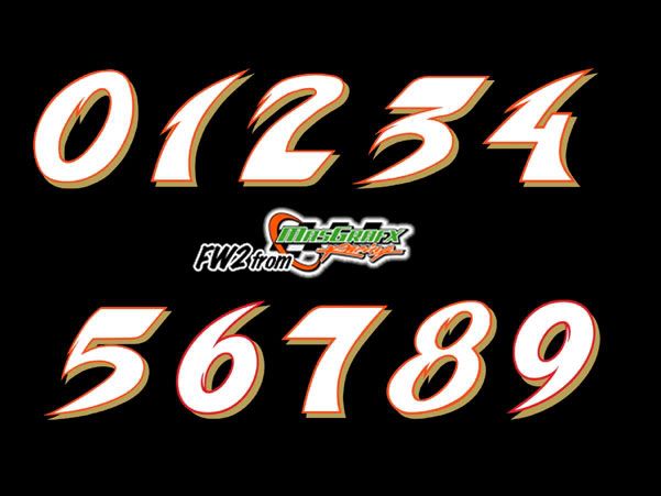
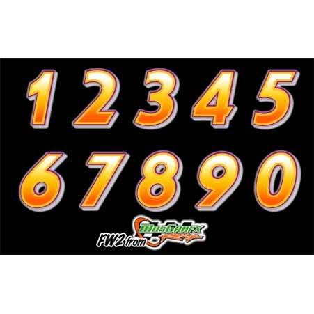
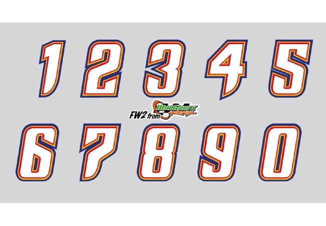
Fonts for the #'s


Thanks guy let me know if you can come up with anything… Colors we wanted to use was neon orange/Yellow and maybe a lil black and silver in that order
damn i wish i had a modified lol.
that looks siq just blue! throw some ghost blue numbers and sponsors on it and run it!
we have just the white #11’s on it now. here is the only pic of it we have from this year

i honestly don’t think there is anyone better then you
Tuck the base color of the car is blue also. So anything that would be orage should be blue… can u do anything with that?
Miss Prixx added some blue for me real quick. Im sure you could do better x100
No matter what he wont change the color of the car so graphics is all we need
dumb question
should the blue and the yellow colors be flipped?
making the flames yellow and the rear of the car blue?
I agree, doesn’t look right to me.
Sorry, I should have realized that you were wanting only the graphics to be “neon orange/Yellow and maybe a lil black and silver in that order”.
Here are the suggestions mentioned but I’ll try some other ideas as soon as I can.

the last one looks sweeettttt
Does my buddy race in your class? #44 Dave Tadesco.
is the car green and black?
as far as i know no car with the #44 has raced @ lancaster yet this season
That name sounds familiar but i cant place a car or face right now.
yeah, it is green and black. and correct…i don’t believe it has raced yet. But i see it outside my window right now with a truck on a trailor. He is racing this weekend.
I asked Dave if he knows your car… he says he’s very familar and knows “Moose” and “Petey”
