I know there are some very skilled photographers on this board and I would appreciate some tips and criticisms.
I’m getting ready to take pictures at a downhill event for a friend and needed some practice.
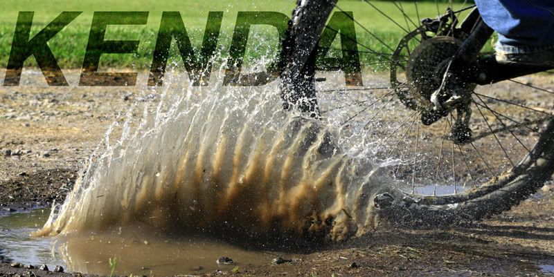
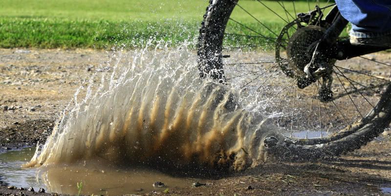
I was playing around with the settings and was only using my cheap $90 lens but these are a few we liked. Experimented with panning some. Also played with them in PS.
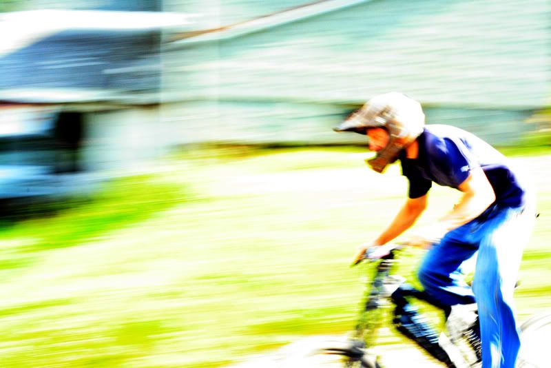
Looks nice except the last one. The over-exposed look is too loud and unappealing to look at. Plus it was beaten to death in the mid to late 90’s.
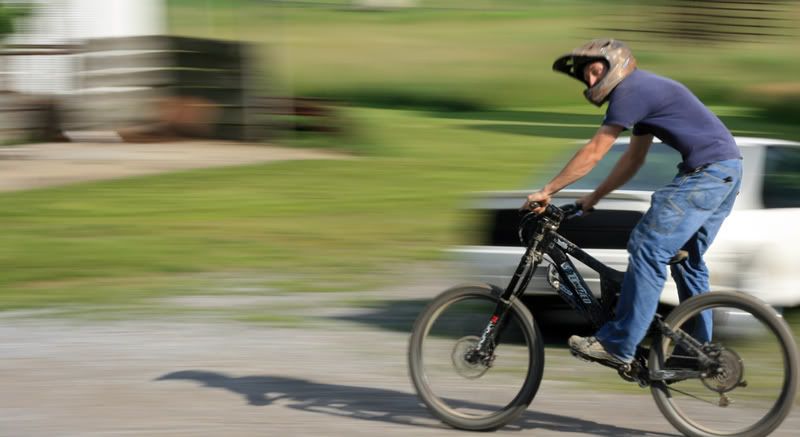
The second last picture seems like there is something missing. Normally to photograph a sporting event you want the whole subject in the frame even if you want it offset to show the surroundings as well. That shot would perhaps have been better served to be have a shorter focal length and then later cropped to almost look like a wide angle shot.
I’ve been known to dabble in photography… been published a few times, nothing major. Only been doing it for 9 years, knocked out a 5 in AP, helped with a few high school and college courses… If you’ll take note, we’ll go into shot #2, because I really do like #1 without the text, and personally wouldnt have put #3 or #4 online (nor would I have saved them on my computer).
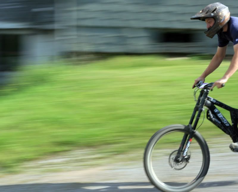
Take a close look at where the focus is, it’s on the logo on the bike, which is nice, however the fstop is slightly to high considering the speed and distance (not much if you consider that it looks like it’s maybe a 90-100mm lense at this point). Which has caused the entire rest of the photo to be out of focus or “not sharp”. My point being that while the basic illusion of speed is there, he needs to work a bit on his composition, focus, and cropping a bit. But I didnt feel like typing it all out as hey, I figured I would get the point across.
the subject should be crystal clear for panning shots. The whole idea of panning is to blur the background. NOT THE SUBJECT.
good photos tho. You def show some skill to be unleashed. I dig the first pic. And again, like MPD said, don’t over p/s decent pics. They just end up looking like shit. get the fundamentals down first.
Yeah, subject needs to be more clear. I was having a hard time getting the focus right because there wasn’t much depth of range available. I need to use a different lens.
The last picture is overexposed because I accidently had the iso set on 1600. oops. I liked it though so I threw it up.
I know what you mean about cutting him off in the second last pic, it is missing something.
I’ll quit on the PS for now and just keep working on the fundamentals. Thanks for the help so far, I still have a long way to go.
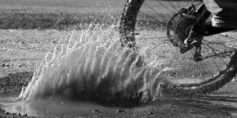
i love the first one… i like it in color vs the black and white… the whole “puddle effect” I felt lost a lot of effect when it was switched to black and white…
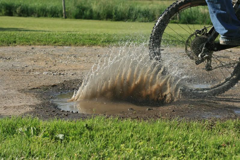
and actually… when seeing the original of that…before it was cropped… i like the cropped version!