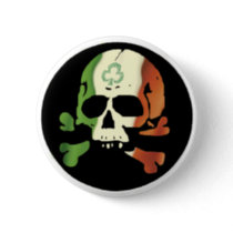
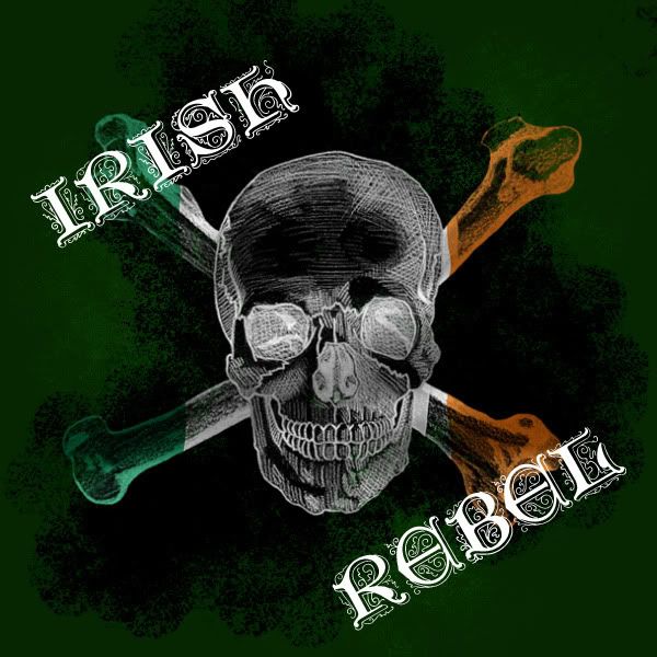
I need a decent looking Skull and cross bones that looks something like this:
OR
OR
This is for a logo on beer. We are naming it “Irish Rebel” and I think that any of those look ok for what I am thinking. I am open to other ideas as well. It would have to be large enough to be on a case and small enough to be on a cap. That is why I need a full file, but it can’t be tooo over complicated as in not able to be scaled down.
Ideas?
Edit: Yes, the shamrock on the first one makes it UBER gay. pretend it is not there. These are just examples of what I have found.
This is what I have at the moment… Can anyone chime in on what looks ok, and what I should change out to make this look cleaner and better?
The black is just a holding background. It will not be there on everything.
You can get nice vector art at sites like vectorstock.com (for a small fee) that you can work with in illustrator.
I would simplify. The font is too busy and looks like you’re trying too hard. Pick something simpler and bold. I would kill the color until the actual design is complete… it influences the overall aesthetic too much. I would just do something like green and white or something.
Simple is always better.
I like the shield label shape, but I dont think it need all the outline. The shape is enough.
I would mock something up, but I am knee deep in a project here at work and need to leave early.
I have plenty of time, and I am willing to pay as well. You are not restricted to my idea, as that is as far as my creativity took me. I guess this is why I sell industrial controls and do not design graphics for a living.
Just keep in mind that this is for the actual brewhouse not the specific beer. the beer bottles will look different for each beer, and the logo will be on the collar and the cap.
Good call. I was going to put a lower jaw or bones and and nixed that idea. Guess I forgot to move the skull back down.
I need the outline due to this having the ability to be printed on any color. I used vector art for a couple of the elements, but I couldn’t find everything drawn out in vector. I could probably convert all of the elements and them place them together. I typically agree that simple is better, but most beer/brewery are it typically colorful and complex to grab the eye as you are walking by it in a sea of competing beer. I guess that was the mind set that I had when I started. I will try and knock back some of the colors and see where it gets me.
The stripe is skewed because that is an imprint of a real flag behind the skull. I didn’t want just the colors, but more of the shadowed effect that using a picture of a blowing flag offered. I skewed the actual crest for various reasons, (1) my family crest has three stars at an angle on a red stripe and I wanted to throw a reference in there for it. Also if everything is straight, it looked too much like a jacket patch and not very “rebellious”
I must say, designing shit is hard. I do not know how those of you that do it for a living do it.