so confused… which one is the correct logo? 
so confused… which one is the correct logo?
Holy Low Flying ROFFLECOPTER!!! :lol:
HAHA. Wow.
Uncanny.
AHAHAHAHAHAy23eeh 338-;484b nnhq :biglaugh:
alternate jersey for the motherfucking w1n :tup:
looks like the girlie will be getting that as her b-day gift. either that or her old-skool white will get lettered. anyone have experience with a good shop in the southtowns? I was thinking al ross in west seneca.
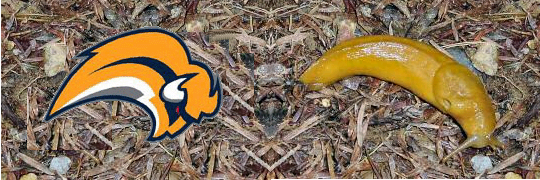
I swear to GOD, I am throwing banana’s on the ice for Hat Tricks.
its just stupid on their part in terms of marketing. They obv had to pay for this logo. i’m sure it was a pretty penny. regardless of the support of the team, I anticipate a severe drop in memorablia sales if our jerseys indeed look as bad as that logo. i hope they don’t, im just saying, if they do.
I would have bought a jersey this year, but not that one. only jersey i could see myself buying right now is a blue and gold
on the other hand, think of the free publicity this has generated for them 
is it actually final?
Yeah its final, but the actual look on the jersey is waht everyone is waiting for. Its probably going to be exactly what is on the ice.
That has already been pulled off the sabres site BTW
probably because of the uproar.
the link that robhimself posted…pic

where are the swords? thought there was supposed to be some on there…on the shoulders
unless they have a picture that just keeps adding parts to the jersey
this just keeps getting worse and worse. I am gonna hold all comments until i see the real jersey this Saturday. Then i will discuss
The sword is part of the slug, its that dark stripe. The sword was there the whole time. And the number on the front is the thing that no other team has…Other than a banana slug.
ROFFLEEEEE
who knows. maybe the jersey will grow on me. I LOVE the colors…no doubt about that. But i will wait till sat to see what it turns out to be
not feeling the number on the front… so who do we get to blame this on the sabres or reebok?
quinn / reebok
and I have a good imagination and I’m still not seeing a clear sword on that buffalo head
I would say mainly the sabres cause ultimately they have the right to say “no we dont like that stupid arena football logo!” I have an idea of what happened here.
Reebok decides that they are goingto modernize hockey jerseys.
contact the sabres and ask them to use their design
sabres initially refuse until money or equipment deal is waived in their faces
the end.
Its pointless to try to change the way the league looks because you will always have teams that will refuse to change the style of their logo. ie toronto, detroit etc…
NFL seemed to go in that direction when all the designs stared to have that “sweeping look” carolina, jacksonville, new england. But then they get to the steelers and browns they look like the odd balls. It surprised me when the bills didnt change their logo with the last jersey change but im happy they didnt.