Looks kinda like my first design… I like it :tup: You just need to add ‘.com’ to it somewhere.
Just keep the ‘tach’ thing out please. It’s getting sooooo overplayed on the web.
And the slogan need to be changed… ![]()
Looks kinda like my first design… I like it :tup: You just need to add ‘.com’ to it somewhere.
Just keep the ‘tach’ thing out please. It’s getting sooooo overplayed on the web.
And the slogan need to be changed… ![]()
sounds like a condom slogan
not done, but my lunch break ended.
^^ I like that a lot :tup:
It’s simple, and could be done in B&W also.
yeah…I only made the banner because someone mentioned making one for the site, so i gave it a shot. I think there are some pretty nice choices for actual logos :tup:
i was just getting ready to say it should have the state outline on it
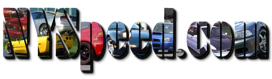
I like your banner Jon, but the cars take my eyes off the text… Too distracting with all the bling!
yes…but its snky snky that way  you’re looking at all the pretty cars and then WHOA you find yourself on NYspeed.com
i like dozer’s a lot :tup:
hands down for the sticker
:word:
nice job Tom. that one works.
how’s this… did it real quick like.

mmmm no editing…
ok, forget trying to link it, just click this to see it:
http://www.filecabi.net/hot1ink16j2ncuntv6:)sw/1119800449.gif
and heres another:
my 2 attempts at simplicity…

or a simpler one…